A thoughtful, AI-assisted redesign of Techwondoe.com
A behind-the-scenes look at how Techwondoe redesigned its website with AI-assisted workflows across research, design exploration, prototyping, engineering, and SEO.
Design·AI ToolingDesign·AI Tooling·Web DevelopmentDesign·AI Tooling·Web Development·12 min read·Jun 8, 2026
When we started redesigning Techwondoe's website, the goal was not simply to modernise the look. We wanted to explore how far we could push an AI-assisted design and development process, from early inspiration and visual exploration through to coded prototypes, blog imagery, SEO refinement, and finally a production-ready build.
The existing website had served its purpose well, but the new one needed to better reflect where Techwondoe is headed: our capabilities, our design maturity, and the calibre of work we want to be known for.
What follows is an honest account of how that process unfolded, the tools we used, the decisions we made, and what we would do differently.
Research before generation
Before touching any AI tool, I studied 20 to 25 agency websites closely: how they use colour, structure content, present case studies, and build a visual identity. The goal was to form a clear point of view before asking any tool to generate one for us. Thoughtful prompts come from clear thinking, and clear thinking comes from knowing the space first.
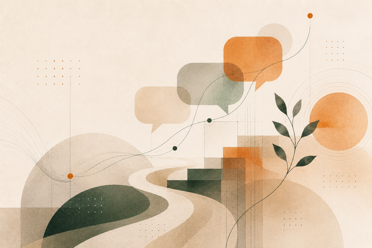
FIG. 01How AI tools and human judgement worked together across each stage of the redesign process
Google Stitch: great for volume, not for originality
Stitch was our first design tool. With a daily credit allowance of around 400, it was ideal for high-volume exploration and we generated over 150 design variations. The colour handling, typography, and overall visual quality were consistently solid.
FIG. 02Four Google Stitch homepage design directions compared side by side for layout and visual style selection
The limitation was originality. No matter how we adjusted prompts, outputs kept landing in familiar, generic territory. Stitch is excellent for establishing a visual baseline, but not for finding something that stands apart from the crowd.
Practical tip: always use Gemini 3.1 Pro inside Stitch, not the default Flash model. The difference in output quality is worth the extra step.
Claude Code Design: fewer credits, sharper results
Claude produced something Stitch could not: layouts with genuine character. The designs felt considered rather than templated, and clearly stood apart from the generic agency look we had been trying to avoid.
The trade-off was a tight credit limit. Even on a Pro subscription, you get roughly three to four designs per week, and even downloading a result uses credits. So instead of iterating, I put effort into building one thorough prompt upfront, using ChatGPT to refine my brief into precise, design-specific language. That single prompt produced the layout that became the foundation of the final website.
When resources are limited, the quality of your brief matters far more than the number of attempts.
Combining both tools
Claude was strong on layout, but its colour and typography felt a little restrained. Stitch was the opposite: visually rich, but generic in structure. The natural move was to combine both, taking Claude's layout direction back into Stitch and using its generous limits to refine the visual language.
This worked well until we hit a practical wall. Our homepage had seven to eight sections, and Stitch could not render a page that long. Splitting it into halves did not work either because the two halves lost coherence. We needed a complete, scrollable design to get meaningful feedback from the team, which led us to Google AI Studio.
Google AI Studio: the bridge to a working prototype
Since Stitch and AI Studio are both Google products, Stitch offers a direct export option. We used this to push designs into AI Studio, where we could write prompts, generate code, and preview the result in one place. Across roughly 40 to 50 prompts, we assembled a complete, scrollable prototype of the homepage, good enough for a genuine approval conversation with the team.
The output was not production-ready code, nor was it meant to be. Its job was to give stakeholders a clear picture of the direction before any production work began. Once approved, we applied the same process to every other page.
ChatGPT: best at the section level
ChatGPT was not well-suited for full-page design, but it proved genuinely useful for individual sections. The approach that worked was asking for four design variants for a single section as one composite image: four options, one credit consumed. We picked the best direction and iterated from there.
It was also valuable for prompt refinement throughout the project, translating rough design intent into precise terminology that improved outputs from every other tool.
Production build and SEO
With all pages approved, we built the production codebase from scratch with proper component structure, reusable patterns, and a clean folder hierarchy. The AI prototypes served as visual reference, not the code base. GitHub Copilot supported implementation, while architectural decisions stayed with the team.
We closed out the project with a technical SEO audit using the AgriciDaniel Claude SEO skill, which surfaced metadata gaps, canonical link issues, and other optimisation opportunities in a clear, structured report.
Blog imagery: a system, not just pictures
Generic AI-generated blog images are easy to spot, and they quietly undermine the content around them. We wanted something more considered.
FIG. 03Design language matrix showing six blog categories with their distinct visual style rules
We defined six fixed blog categories, and every post belongs to one of them. For each category, we built two layers of design guidance: a core DNA that applies to every image across the board, and a category visual that defines the specific colour treatment and style for that category.
Now generating a blog image is simple. Give the AI the post title, a short summary, and the full design system. It categorises the post, picks the right visual rules, and generates accordingly. The result is a blog feed where images feel intentional, and where a reader can tell at a glance whether two posts belong to the same category.
What we would do differently
The biggest gap in our process was not defining a design language at the start. Styles like glassmorphism, brutalism, editorial, and neumorphism each have specific rules around layout, depth, and component behaviour. Had we picked one upfront and referenced it consistently across every tool and prompt, the outputs would have been more coherent and mid-process refinement would have been significantly lower.
It is a simple decision with a large downstream impact: define your design language before you generate anything.
Final reflection
AI did not design or build this website, but it was present and useful at every stage. It helped us explore more directions in a week than would have been possible in a month, and get to a reviewable prototype before writing a single line of production code.
The design thinking, the engineering judgement, and the decisions about quality were never delegated. What AI offered was pace and breadth. That is a fair and accurate picture of what AI-assisted design delivers today.